fabric

check yourself.

Jenny Kayne's Holiday Party - Domaine

Some design “trends” aren’t actually trends at all – because they’ve been around for decades, but recently have gained more love. This is especially true for checkered and plaid patterns. Just search the terms on Instagram or Pinterest, and you’ll see many awesome examples of using these patterns in a modern way.

BUFFALO CHECK

This fabric is typically classified by 1 or 2 colors on a light background, created by horizontal and vertical stripes of equal thickness crossing over each other to form squares.

It’s everywhere right now. On chairs, pillows, even on bathroom floors!

Checkered Bathroom Floor - Studio McGee

Black and White check is so classic but most importantly of all, very versatile. It mixes well with other patterns. You can do dots, floral, solids – the sky’s the limit.

It crosses over to many different design styles. Pictured below on this mid-century style chair by Schoolhouse Electric.

Studio McGee - Lynwood Remodel
It goes more transitional here with Caitlin Wilson’s pillow and rug collection.

Caitlin Wilson Navy Buffalo Check Pillow

PLAID

I grew up in the Catholic school system.  I wore a plaid jumper everyday for about 6 years. Needless to say, I was over anything resembling plaid. Putting my childhood aside, I’d be crazy to deny that it’s making a comeback. And I think I kinda, sorta, dig it.

Emily Henderson - Let's Get Cozy

There is some crossover between check and plaid, but plaid usually consists of 2 or more colors and the stripes vary in size and spacing.  It’s kinda like Buffalo Check’s uptight older sister. It tends to feel a little more formal, sophisticated, and traditional than the playful checkered patterns.
Dash & Albert Cooper Navy Jute Woven Rug

So the question is- are you Team Check or Team Plaid?

___

Sources: 1 | 2 | 3 | 4 | 5 | 6

Save

my journey as told through 2 fabric books

It’s Monday. I usually don’t post on Mondays, but I kind of have a story to tell this time.  So here goes….

Over the weekend, I was cleaning out my office and decided it was time to purge.  As you may know, parting with anything sentimental is not an easy task for me. I came across a couple of artifacts that have made it all the way from FL, back to MI, again to FL, and now to TX.  2 beautiful fabric books that I kept from my first design job ever.

IMG_1484

It’s like it was just yesterday. I was 22 and interning for Kim Ederer. She actually believed me when I said I would move to Florida for 12 weeks in the summer to intern. She gave me a chance, and I was so excited. I found a studio to rent in Inlet Beach for that summer in 2007. I remember just how excited I was to go to work everyday. I was like a design sponge – soaking up all the beautiful fabrics and furniture, learning as much as I could about the process. I was blown away by just how much more fast paced it was in comparison to my classes.  And just how poised Kim and Rosanne were as they tackled everything from a freight damaged table to a client presentation. I never wanted my internship to end, and I only hoped I could grow up and be successful like them.

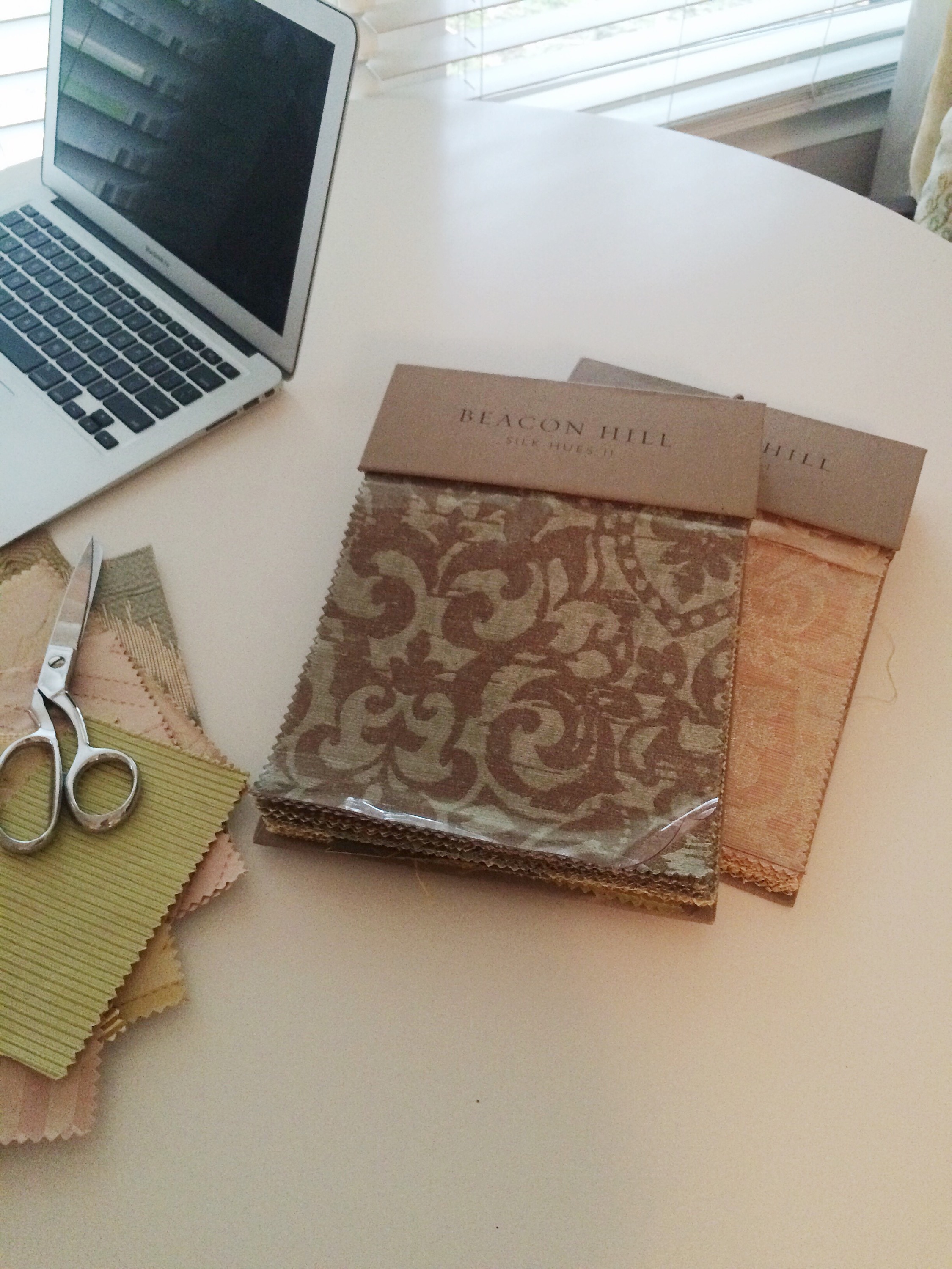
That summer they moved offices, so taking on an intern to clean out and reorganize that massive fabric library was a huge selling point.  As I sifted through hundreds of fabric books, I came across 2 duplicate books. They were absolutely gorgeous. Instead of throwing them away, I kept them. I just thought the patterns and colors were so beautiful. So when my internship ended, I took them back up to Michigan with me.  I showed my design friends my treasured books and told them all about my Florida adventures.

That next summer after graduation, I moved to Florida.  The books came with me.  Finding a design job was not easy. It was 2008 and the recession had just hit. I had $1000 and an air mattress to my name, but more importantly, a will to be successful. I worked in an art gallery, as a waitress, and for a lawyer that year.  From time to time I’d crack open those fabric books and keep the dream alive of landing a job in the interior design field. A year later in 2009, I went into Pizitz Home & Cottage with my resume. They weren’t hiring, but they said they’d keep it on file. About a month later I got a phone call saying they could use some extra help for the summer. I was elated. I put in my 2 weeks notice at the immigration law office and I was on my way.

IMG_1485

Working for Pizitz blew me away. I was surrounded by beautiful things, friendly people, and a gorgeous backdrop for over 2 years. I’d eat my lunches overlooking the ocean.  Seaside was just so perfect and amazing.  It was really too good to be true, although looking back I think I was too young to realize it.  In September of 2011, Nate received a job offer in San Antonio he couldn’t refuse.  We were young, newlywed, and ready for the world.  I was the driving force behind it all.  The economy was so good in Texas, and I figured I could get some great design experience. I envisioned what city life would look like, and it was enticing.  We quickly said goodbye to the beach, packed up our townhouse, and headed to the Lone Star State. It was exciting and scary as hell.

The economy was as good as I imagined.  I found a job within 3 weeks at a crazy busy design firm in San Antonio. I didn’t feel completely settled yet, but I was ready to jump in.  The vibes were different from the beach though. I traded in my flip-flops for black pumps, and my jeans for dress pants.  Although I was stressed out 24/7, I tried to keep a laid back attitude.  It was hard for me when that outlook wasn’t accepted or understood. I remember the designer I worked for literally saying to me, “Aren’t you freaking out??”. Umm yes, I was inside. Being miserable was the norm around there, so if you were happy it must mean you weren’t working hard enough.  I felt like I couldn’t be me. I felt like I couldn’t celebrate design or have a life. I felt like a robot, cranking out work with no emotion. Finally I couldn’t take it anymore. It wasn’t rocket science.  It was interior design.  After 2 years of that crap, I took my life back, realizing I never would want to climb up that company ladder.

Instantly, a huge weight had been lifted. My job search efforts led me to 2 offers.  I decided to take the more unconventional one, working from home and in Austin.  I couldn’t have made a better decision.  Michelle is the most understanding and fun person. She gave me my creativity back, and in a sense, my life. I’ve learned more about design and really myself than I have in recent times. We work hard and we play hard, which has always been my philosophy. Austin is such a creative and inspiring hub, pushing the limits with design. It’s exactly what I needed.

IMG_1483

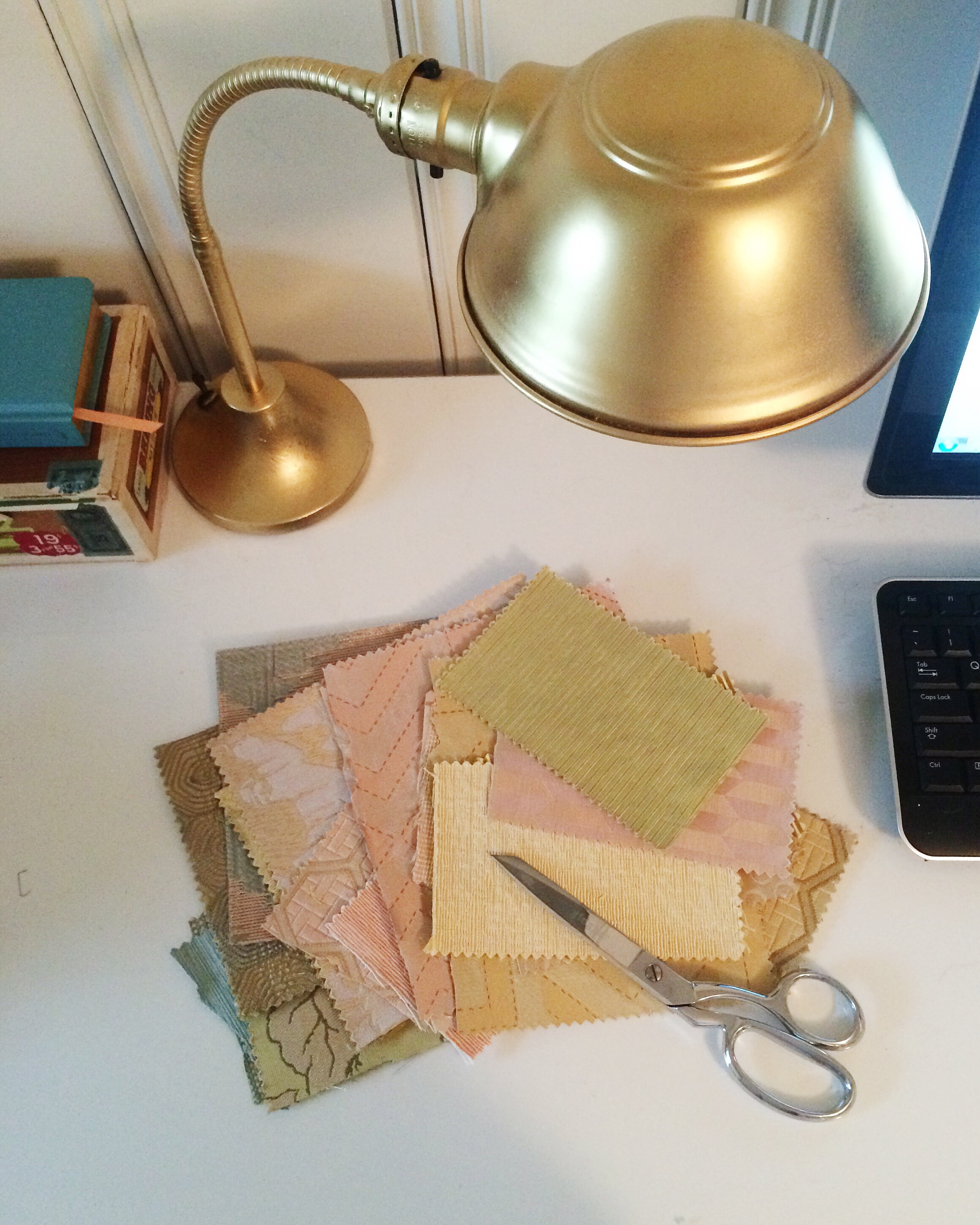
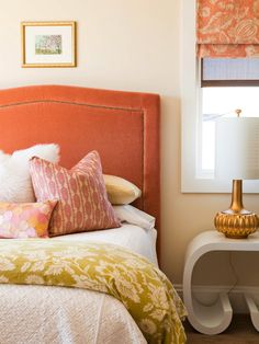
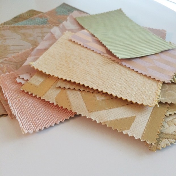
Working at home has helped rejuvenate me.  Of course if you’re going to work from home, you most definitely need to be organized, or else it doesn’t work out too well.  As I’m attempting to downsize my collection of books, samples, and other stuff, guess what I stumble upon?  Those 2 books. Flipping through those fabrics took me back 8 years. I went back through the journey and relived what has become my story.  I became emotional, but in that moment I didn’t understand why.  I can finally say I’m inspired in the way I as back then. I really didn’t want to part with the books, I cut out some of my favorite fabrics out of them.

Sometimes I wonder if leaving Florida was the right move.  I still feel like my heart is there.  Like maybe it’s the place I’m still meant to be.  But deep down I know there are no mistakes.  Everything happens for a reason. I’ve gained so much knowledge here in Texas. I’ve learned what I want to be like, and what I don’t want to be like in my career.  Some of our friends living in Florida seem to think we’ll end up there again one day.  Who knows. Maybe we will.  But what I do know is that I’m just so eternally grateful to be part of the career field I’m in.  I’m happy I stuck with it.  I’ve been a good mixture of lucky and blessed in my life, sharing it all with some great people along the way.  I’m proud of how far I’ve come, and look forward to where the future will take me.

there are no mistakes only opportunities.  - tina fey

color story: camel + navy

I love the color of camel specifically because it can instantly dress up any space.  It feels, warm, rich, and sophisticated.  While Navy’s personality gives off different vibes – nautical, bold, traditional – these two totally compliment each other. If you’re going for a look that is classic and stylish, but not overly feminine, these 2 are for you.

camel + navy living room by Rosa Beltran

camel coat + navy shirt


Try throwing some fun pattern in the mix, such as leopard.

The Everygirl Carly Haslee - camel + navy

Pair with textures like acrylic or metallic for a more modern feel.


fun navy dining room


camel + blue dining room

Use these 2 as a color pop in with light walls to enhance a neutral space.

Or go with a deep blue paint color to make the space feel warm and masculine.


navy bedroom with camel headboard

These colors have a way of feeling “dressed up” but they can also be more casual too!

camel skirt + navy top

Here’s some ideas to bring the palette into your home just in time for the fall season:

camel + navy inspiration color board

  1. You can’t go wrong with a simple, streamlined leather sofa
  2. Don’t be so square! Do 3 navy lumbar pillows for a nice twist
  3. Loving this retro mod fabric by Robert Allen
  4. Mix up the patterns a bit with this Duralee fabric
  5. Accent chairs in deep blue velvet add drama and contrast
  6. Add luxury and texture with a cowhide rug
  7. He may be little, but this brass side table will sure make a statement
  8. Swooning over this leather wrap watch
  9. Large scale photography prints are flexible and come at a lower price tag as original art
  10. These leather chairs are great for the dining area, or can also act as an accent piece
  11. Navy handbags are fun and work for all seasons

For the sources to these items and more, check out the Camel + Navy board on V&V’s Pinterest page!


(all the images above link back to their source, if known)

color story: citrus tones

We all draw our inspiration from different places.  Finding inspiration in food… that’s perfectly normal, right?   Yup.  Some of the most cheery colors out there are citrus tones.  Lime, grapefruit, orange, lemon…  They are like little works of art.  Especially when styled like this pic below:


lovely citrus shot

And besides, what’s summer without good music,  longer days, – and of course – bright colors?


citrus tones style


Oh and Margaritas!! Can’t leave that off the list!!  (Click the picture below for the recipe to this Pink Grapefruit Lime Margarita)Grapefruit Agave Margarita recipe - Serena Bakes Simply From Scratch


Honestly, this may be my favorite color palette in the world.  (I may have said that before in a blog post, but I was just kidding, and am super serious now.)


citrus tones paint palette

I mean, some of my favorite interior shots EVER are in this palette:


colorful living room, featured in Coastal Living


You may remember the image from above.  This home was featured in Coastal Living.

green banquette! - vim + vintage

And this one: well if a green banquette doesn’t make you smile, I don’t know what will.

Tastefully done with some more traditional flair.

vintage citrus tone bedroom


This nugget below made the cover of Southern Living’s May 2012 issue.  For me, it still remains one of the best mixes of prints I’ve seen in an interior.

Lindsey Ellis Beatty Living Room - featured in Southern Living

And let me just say – Mandi at Vintage Revivals is the bomb-dot-com, because she gets the last 2 photo mentions.

This first one is the love child of retro vintage and bohemian styles and it’s awesome.  retro bohemian bedroom, featured on Vintage Revivals

And YES, one of my favorite DIY projects of all time!!! Seriously, still can’t get over that hex wall.  She’s a genius!

DIY Tufted Picture Frame Headboard - Vintage Revivals

MYTH #1:  You have to live in FL to rock these colors.

MYTH #2:  Using a bunch of bright colors together creates disaster.

As proven by the pictures above, both of these statements are totally false!  Yes, these colors do favor coastal environments, but when done right, anyone can pull off this look.  Intermix some of these fresh tones in, and the fruits of your labor will pay off (See what I did there?)

.

citrus tones color story inspiration board - Vim & Vintage

1 // such an awesome book with inspiring bright colors, from Will Taylor of Bright Bazaar

2 // I don’t think it’s possible to talk about bright colors and not bring in some Jonathan Adler.  This chair comes in a variety of finishes and colors!

3 // of course you need some fun fabrics.  ( Clockwise from top left: Robert Allen Out of Bounds Chartruese, Kravet Almora 712, Robert Allen Delighted Citrine, Robert Allen Cats Cradle Papaya)

4 // yes, I always have to feature a watch.  This Michael Kors one is pure dynamite!

5 // pretty pillow cover

6 // most possibly the cutest set of measuring cups

7 // simple, elegant, and versatile summer wedges

8 // I wish I could have each and every one of Madeline Weinreb’s rugs.  They are absolute perfection

9 // another fun, midcentury-inspired JA chair!

10 // vintage vase in a fun yellow color!

.

Have yourself a bright and cheery day! xo

(inspiration board is my creation, but all other photos link back to their original source)


design obsession: scalloped

You know what shape I’m loving right now? (I’ll give you one guess, and it may or may not be in the title of this post.)

The lovely scallop shape is derived from my favorite childhood shell with the same name.  Its curved edges takes me back to when I was a 7-year-old seeing the ocean for the first time, and the hunt for the perfect one.   The form is soothing and organic, but creates incredible interest when turned into a pattern.  It can be retro.  It can be modern.  Originating from nature, the scallop shape is timeless.


scalloped accent tile wall in bath


scalloped floor mosaic design

colorful scalloped skirt

scallop wallpaper   scalloped shorts

scalloped tile

scalloped wall

Can I have these tables? Pretty PRETTY please??!

scallopped tables


Some of my scallop faves on the web:

scalloped inspiration board - Vim & Vintage blog (may 2014)

  1. Scalloped Crewel Pillow Cover, West Elm
  2. Dallas Multi Fabric, Duralee
  3. Ludlow Mineral Green Fabric, Robert Allen
  4. Vero Chair, Arteriors
  5. Marysia Hot Pink Bandeau Bikini , Intermix
  6. Cocktail Table, Mr & Mrs. Howard
  7. Scalloped Bowl, Oh Joy! for Target
  8. Vintage 1940’s Art Deco Planter with Scalloped Edges,  The White Pepper on Etsy
  9. Wavy Hello Flats, ModCloth
  10. Lira Pendant, Arteriors
  11. Martha Stewart Damask Trace Quilt & Shams, Macy’s
  12. Zeb Accent Tables,  Arteriors
  13. Scallop Polymer Clay Necklace, A Quiet Curiosity on Etsy
  14. Lacey Denim Shorts, Free People
  15. Metallic Scalloped iPhone 5 Cover, Anthropologie


For links to these items, visit Vim & Vintage’s Pinterest Page!


(all images link back to their source)