Color

what color to paint my door?

Being a designer is a funny thing sometimes.  Like I can help others with their homes all day long, but when it comes to my own home, forget it. I look at endless options and so the project just kind of lingers out there forever.  I’ve heard this before and it’s painfully accurate: I’m my own worst client.

Okay, so the backstory:  I’ve been thinking about painting my back door an accent color for about the last year. Well I’m finally going to do it, but need to make a decision on the color.

Here’s some of my favorite inspiration pics:


Painted Door - Claire Zinnecker - Farrow & Ball Light Blue


Chelsea Fullerton's Yellow Door - Home Tour on the EveryGirl


Jenny Piazza's Front Door - Country Living


Door in Essaouira Morocco - by Maryam Montague

Sources:  1 | 2 | 3 | 4

From the white bungalow to the Moroccan entry, clearly I’m drawn to soft and playful colors.   Which one is your favorite??

PS> My exterior is like a taupe color now. We’re looking to paint the exterior soon as well, possibly to a richer warm gray.


color story: camel + navy

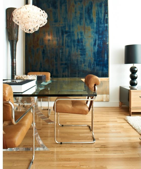
I love the color of camel specifically because it can instantly dress up any space.  It feels, warm, rich, and sophisticated.  While Navy’s personality gives off different vibes – nautical, bold, traditional – these two totally compliment each other. If you’re going for a look that is classic and stylish, but not overly feminine, these 2 are for you.

camel + navy living room by Rosa Beltran

camel coat + navy shirt


Try throwing some fun pattern in the mix, such as leopard.

The Everygirl Carly Haslee - camel + navy

Pair with textures like acrylic or metallic for a more modern feel.


fun navy dining room


camel + blue dining room

Use these 2 as a color pop in with light walls to enhance a neutral space.

Or go with a deep blue paint color to make the space feel warm and masculine.


navy bedroom with camel headboard

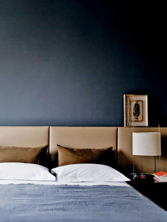
These colors have a way of feeling “dressed up” but they can also be more casual too!

camel skirt + navy top

Here’s some ideas to bring the palette into your home just in time for the fall season:

camel + navy inspiration color board

  1. You can’t go wrong with a simple, streamlined leather sofa
  2. Don’t be so square! Do 3 navy lumbar pillows for a nice twist
  3. Loving this retro mod fabric by Robert Allen
  4. Mix up the patterns a bit with this Duralee fabric
  5. Accent chairs in deep blue velvet add drama and contrast
  6. Add luxury and texture with a cowhide rug
  7. He may be little, but this brass side table will sure make a statement
  8. Swooning over this leather wrap watch
  9. Large scale photography prints are flexible and come at a lower price tag as original art
  10. These leather chairs are great for the dining area, or can also act as an accent piece
  11. Navy handbags are fun and work for all seasons

For the sources to these items and more, check out the Camel + Navy board on V&V’s Pinterest page!


(all the images above link back to their source, if known)

color story: blush + gold

Blush and gold.   Together they are glamorous, soft, and romantic.   The ultimate girly combo? Maybe…. but this color scheme can be used in many more places than just your daughter’s bedroom.    kitchen with pink & gold accentsSee! Even in the kitchen!  A little accents go a long way.

be happy be bright be you

I love this poster by the way.  A purchase waiting to happen.

blush and gold - color scheme


blush coat with gold buttons

blush and gold event decorPERFECT wedding colors.

blush and gold

Or for a shower or party for that matter.

blush blazer with gold top

pink cocktails


pink and gold accessories

blush pink peoniesOh no big deal… just my FAVORITE flowers EVER.

pink and gold office design

This office is pretty much perfection.

pink and gold stationary

Mariah Careys closet!

And yes, I will end on a photo of  Mariah Carey’s amazing closet!  You’re welcome.

.

blush and gold color scheme- inspiration board


  1. Moose Head with Gold Antlers, Etsy
  2. 25 Small Heart Tags, Etsy
  3. Rock Chrono Watch, Marc Jacobs
  4. Roundish Mini Bowl, cb2
  5. Fleming Double Pocket Bag, Tori Burch
  6. Whirl Flats, Jimmy Choo
  7. Gold and Pink Love Digital Downloadable Print, Etsy
  8. Janey Pillow, cb2
  9. Drop Earrings, LC Lauren Conrad
  10. Mink Pink Eyes on the Prize Skirt, LuLu’s
  11. Modern Geometric Pink Pillow Cover, Etsy

For links to all items, visit Vim & Vintage’s Pinterest page!

.

 (all pictures link back to their source.  inspiration board credit: me)

color story: coral + gray

Coral is natural, romantic, and playful.  It gives off those happy, feel-good vibes.  Gray is neutral, reserved, and agreeable.  When paired with together, coral shines through, providing a unique look while emitting believability and flexibility.  These 2 colors collectively radiate sophistication, whimsy, and flair.

Coral & Gray Living Room - The Graphics Fairy

Gray & Coral

.

coral gray & yellow outfit

coral vanity

   coral living room

.gray exterior with coral windows

Coral & Gray pumps

coral & gray

.

My picks for coral & gray !

.

coral and gray color board.

  1. La Mer Bali Wrap Watch
  2. Coral and Charcoal Open Shoulder Tie Dye Top
  3. Kenneth Cole Know Way Sandals
  4. Mossimo Striped Scarf
  5. Betsy Johnson Tough Love Satchel
  6. Modern Orange Ovo Lamp
  7. ZGallerie Harrison Sofa
  8. Sanderson Pippin Wallpaper
  9. Schumacher Imperial Trellis Wallpaper
  10. Coral & Charcoal Geometric Pillow Cover
  11. Quilted Ombre Pillow
  12. Dot Stripe Toss Pillow

.

(all images link back to their source, if known)

love it or hate it: Sherwin Williams new numbering system

So I recently learned that Sherwin Williams entire numbering system is in the process of changing!  Many of you familiar with the system know it was a 4 number system, and now they’re going to a 5 number system.  And the numbers are not similar at all.  For example, Pure White was SW 7005, and now is SW 30008.

Translation:  I’m gonna have to relearn all of my most favorite numbers again!  EEEKKK. Oh well.  I GUESS I’ll adapt.

The silver lining?  Word is there is about a 100 new colors in this new system.

Oh and these are what the new swatch cards look like:

sherwin williams paint colors 2014

They remind me of trading cards.  I think I kinda like them.

How do you other designers/home renovator/Sherwin Williams paint lovers feel about this?  Love it or hate it??

PS. TGIF! 🙂