Interior Design

check yourself.

Jenny Kayne's Holiday Party - Domaine

Some design “trends” aren’t actually trends at all – because they’ve been around for decades, but recently have gained more love. This is especially true for checkered and plaid patterns. Just search the terms on Instagram or Pinterest, and you’ll see many awesome examples of using these patterns in a modern way.

BUFFALO CHECK

This fabric is typically classified by 1 or 2 colors on a light background, created by horizontal and vertical stripes of equal thickness crossing over each other to form squares.

It’s everywhere right now. On chairs, pillows, even on bathroom floors!

Checkered Bathroom Floor - Studio McGee

Black and White check is so classic but most importantly of all, very versatile. It mixes well with other patterns. You can do dots, floral, solids – the sky’s the limit.

It crosses over to many different design styles. Pictured below on this mid-century style chair by Schoolhouse Electric.

Studio McGee - Lynwood Remodel
It goes more transitional here with Caitlin Wilson’s pillow and rug collection.

Caitlin Wilson Navy Buffalo Check Pillow

PLAID

I grew up in the Catholic school system.  I wore a plaid jumper everyday for about 6 years. Needless to say, I was over anything resembling plaid. Putting my childhood aside, I’d be crazy to deny that it’s making a comeback. And I think I kinda, sorta, dig it.

Emily Henderson - Let's Get Cozy

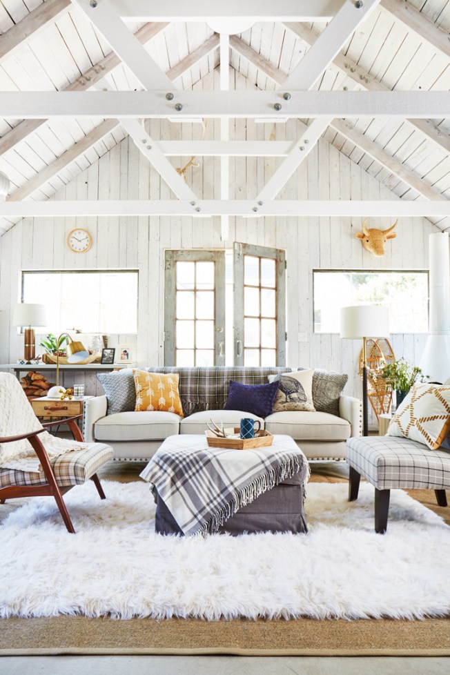
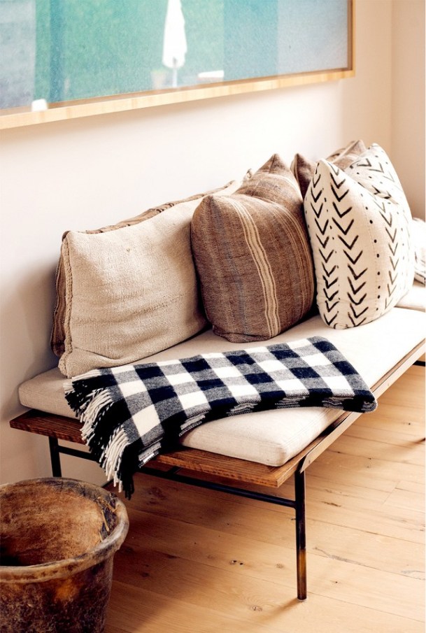
There is some crossover between check and plaid, but plaid usually consists of 2 or more colors and the stripes vary in size and spacing.  It’s kinda like Buffalo Check’s uptight older sister. It tends to feel a little more formal, sophisticated, and traditional than the playful checkered patterns.
Dash & Albert Cooper Navy Jute Woven Rug

So the question is- are you Team Check or Team Plaid?

___

Sources: 1 | 2 | 3 | 4 | 5 | 6

Save

what color to paint my door?

Being a designer is a funny thing sometimes.  Like I can help others with their homes all day long, but when it comes to my own home, forget it. I look at endless options and so the project just kind of lingers out there forever.  I’ve heard this before and it’s painfully accurate: I’m my own worst client.

Okay, so the backstory:  I’ve been thinking about painting my back door an accent color for about the last year. Well I’m finally going to do it, but need to make a decision on the color.

Here’s some of my favorite inspiration pics:


Painted Door - Claire Zinnecker - Farrow & Ball Light Blue


Chelsea Fullerton's Yellow Door - Home Tour on the EveryGirl


Jenny Piazza's Front Door - Country Living


Door in Essaouira Morocco - by Maryam Montague

Sources:  1 | 2 | 3 | 4

From the white bungalow to the Moroccan entry, clearly I’m drawn to soft and playful colors.   Which one is your favorite??

PS> My exterior is like a taupe color now. We’re looking to paint the exterior soon as well, possibly to a richer warm gray.


thursday thoughts: the psychology of design

Being a designer is my dream career field. When I tell people I’m a designer, I usually get one of a few similar reactions:

“Oh that sounds so fun!”  (It can be, but it is also hard work.)

“You can come help me pick paint colors!”  (Great. Sounds like a plan. But don’t forget we do soooo much more than just that.)

“Your home must be AMAZING!”  (Being a designer does not mean my house is automatically amazing just by default.  To have a beautiful home, you must have the money and time – you are lucky if you have both.)

Sure we are creatives and project managers.  But we are also a bit like therapists.  Clients come to us because they want guidance, advice, and/or reassurance.  They have a problem they are unable to solve on their own.  Or maybe they just want to talk it out. They have a list of wants and needs and are hiring us to fulfill them.  (No pressure, right?)  It is up to us as designers to decipher these conversations and ideas into tangible results.  And how does one do that?

The secret to success of being a designer is to “get” our clients. To truly understand them and deliver a design they never thought possible.  We must listen to what they say, and what they don’t say.  Give them a beautiful space or home that is also functional and reflection of their life and what they love.

You can see why I say I have a dream job.

This quote by Barry Dixon is what inspired today’s post:

Barry Dixon Quote

Hope everyone has a great day!  If you are a designer, take a moment to realize how amazing your job is.  For everyone else, be true to yourself and make your home a reflection of you.  Fill it with things you love and that bring you joy. If you need help with that, hire me.  🙂

xo.


highpoint market faves

Hi!

So last month, I was able to cross something off my design bucket list.    MTD took us girls on a 4 day trip to this little thing called Highpoint Market.

Seriously I was so excited when I found out we were going.  It has been one of my dreams since my college days at Michigan State.  To grow up and be a real legit designer and go to the biggest residential furniture trade show.

It was amazing. We found some great new lines. It was also so helpful to sit in, touch, and see the quality firsthand of some furniture pieces we’ve been eyeing for a long time.  Yes, “shopping” for work is enough to make anyone jealous, but I’m not going to lie, it was exhausting.  We covered about 6-7 miles a day on foot.  Probably the first trip I’ve ever taken and not gained weight.

Here’s some of my favorite finds from this amazing trip.   Hope you enjoy!

IMG_3750IMG_4468

IMG_3989IMG_4325IMG_4132IMG_4078IMG_4062\IMG_4083

IMG_4584IMG_4466IMG_3995IMG_4075IMG_4438IMG_4335IMG_3766IMG_3714IMG_4076IMG_4216IMG_4366IMG_4520IMG_4360IMG_3712


color story: moss + pink

Pink has always been a chic, feminine color.  But using pink in your home doesn’t have to say, “hey look at me, I’m a girls bedroom!”  If it feels too girly for your taste, jazz it up with mossy green to create a fun, welcoming space!

These colors tend to create a more traditional feel, but depending on the patterns and textures used, the look lean towards bohemian, modern, or tropical.

Camille Styles studio

Caladiums via Southern Living

Pink and green style fashion

Here’s a nice variation with coral & some gold!

Emily Henderson Bedroom - green, coral, gold.

pretty office via Style Me Pretty

pink and green color palette

Pink and green camper design

Real Simple color combinations

Here’s a few of my favorite picks for this color combo:

moss green and pink color story

For the sources, please visit Vim & Vintage’s Pinterest Page.  Enjoy your Tuesday!