
thursday thoughts: wander

Tomorrow is the day that I’ve been looking forward to for quite some time now. We get to hop a plane and escape to Philadelphia for Nate’s bro’s wedding! I can’t believe Memorial Day weekend is already here. (Time just flies when you are remodeling and unpacking.)
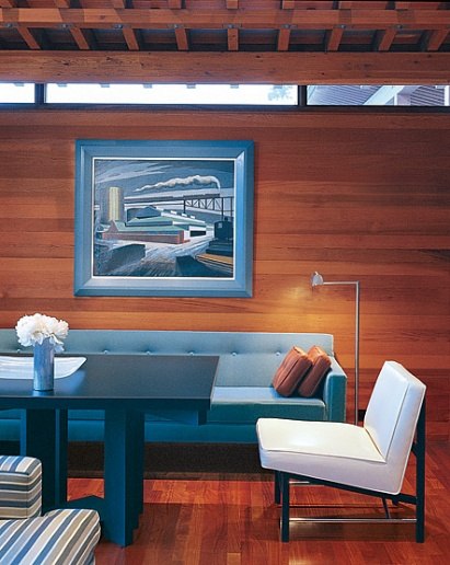
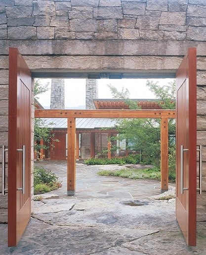
In honor of our getaway to the East Coast, I’ll leave you with this dreamy hillside home tucked in Pennsylvania’s Blue Mountains . Featured in AD, this home was designed by Peter Bohlin of the Pennsylvania-based architectural firm, Bohlin Cywinski Jackson. (I’ll have you know that Peter was a graduate of Michigan’s Cranbrook School of Art. REPRESENT!!)
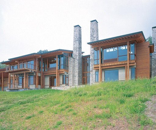


In the article, Peter described the client’s desire for a timeless space. I think I fall in love with the idea of something being “timeless”…that time can pass and it remains just as true, believable, and fabulous as day one. It’s such a hard concept to achieve with all of the trends in the design world. It really makes you think hard about what will withstand the test of time vs. what is a fad.
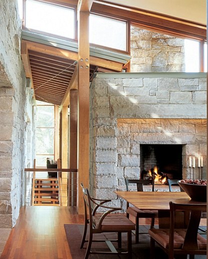
For me, what makes this home so special is the use of materials and furniture pieces that aren’t fussy or easily dated. This must be why mid-century furniture holds a special place in my heart :).


Bon Voyage! I gotta go get ready for this trip! You will hear more from me when I return. 🙂 Happy Memorial Day weekend!
.
(all images link back to their original source)

Chartreuse and Plum: A dynamic duo. Fresh and spunky, yet deep and powerful. They are not your usual couple, but hey I’ve heard opposites attract. Even as bold as each color is, these two can share the spotlight together if done correctly.
.
Both colors a little muted here and they compliment each other beautifully.
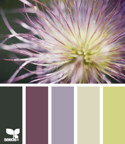
Love it with the lilac or raspberry too!
.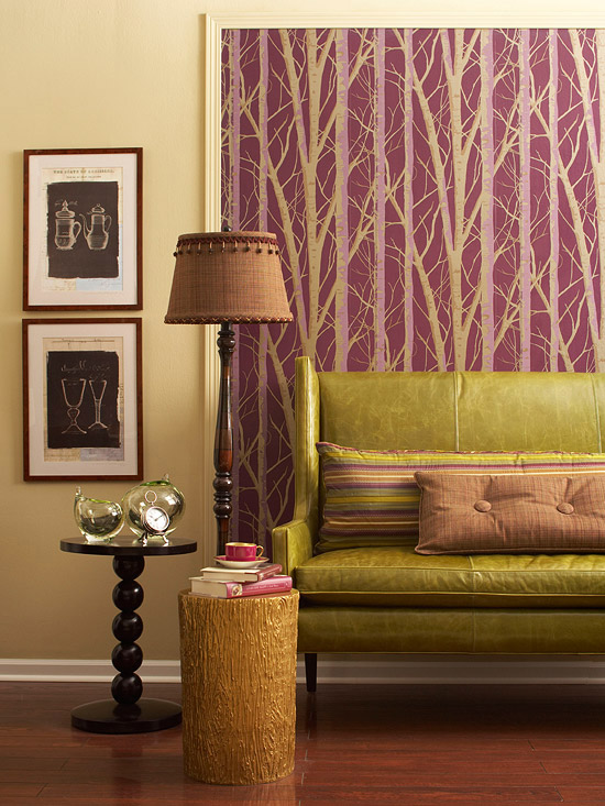
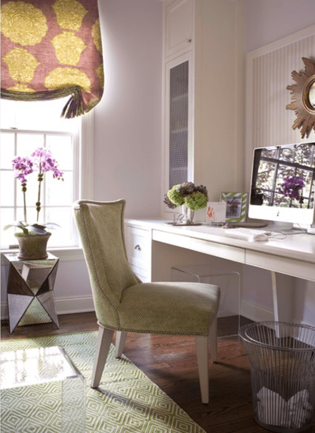
The key is to blend the greens and purples with other neutrals, browns, blacks, or whites. Mixing in rich brown tones and/or black (as shown above) gives off a luxurious feel. Or use white in the color scheme (shown below) to achieve a more serene & sophisticated environment.

Using gold with these 2 colors looks great too!

Bold colors = modern feel
.
Just a few favorite items put together just for you! 🙂

a: robert allen alpenglow fabric / b: suburban home ringo fabric / c: centenniel sofa (available to the trade only!) / d: cb2 rex chartreuse chair / e: z gallerie new hope plum art / f: rug (available to the trade only!) / g: crate + barrel link pillow / h: etsy decorative handmade floral pillow cover / i: jonathan adler capri lamp / j: jonathan adler lime lacquer cube
.
(all photos link back to their original source, if known. inspiration board brought to you by yours truly.)


